Piece of Pi: Case Study

Mascot Development
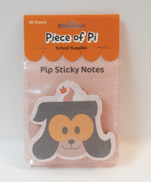
Piece of Pi was created by combining many inspirations such as cute Japanese character brands like Hello Kitty and Rilakkuma, cute, tasty pastries and sweets snack brands, and fun looking writing tools. From all this, the brand mascot Pip the Pi Pup was born and was ready to get children interested in learning.

Style Guide
To match the feeling of the brand, a cute and round typeface family was chosen for the designs. Along with that, a cute and tasty looking color palette was made to appeal to both the younger students using the supplies but the teens who wanted to express themselves through the product. It is a bit more mature than a color palette meant for kids but still fun.

Final Logo
Once Pip the Pi Pup’s look was finalized, it was easy to create the final brand logo. I decided to use a fun typeface that feels hand written for the main brand name with an offset color form behind to clearly communicate the fun and approachable feeling of the brand.