Polygon Magazine Case Study
Development
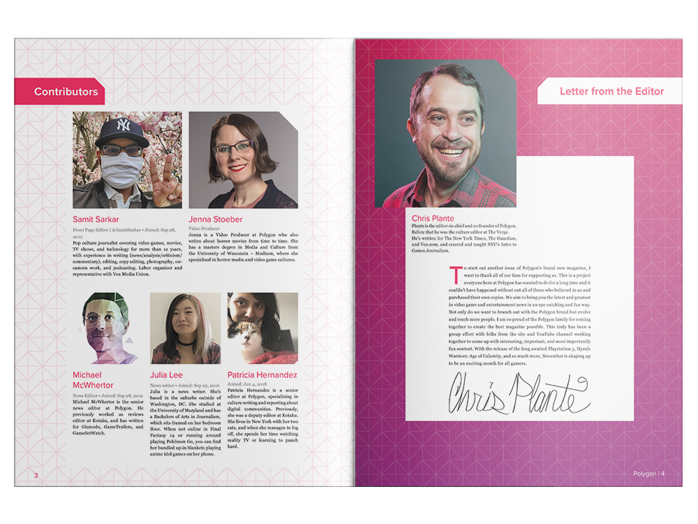
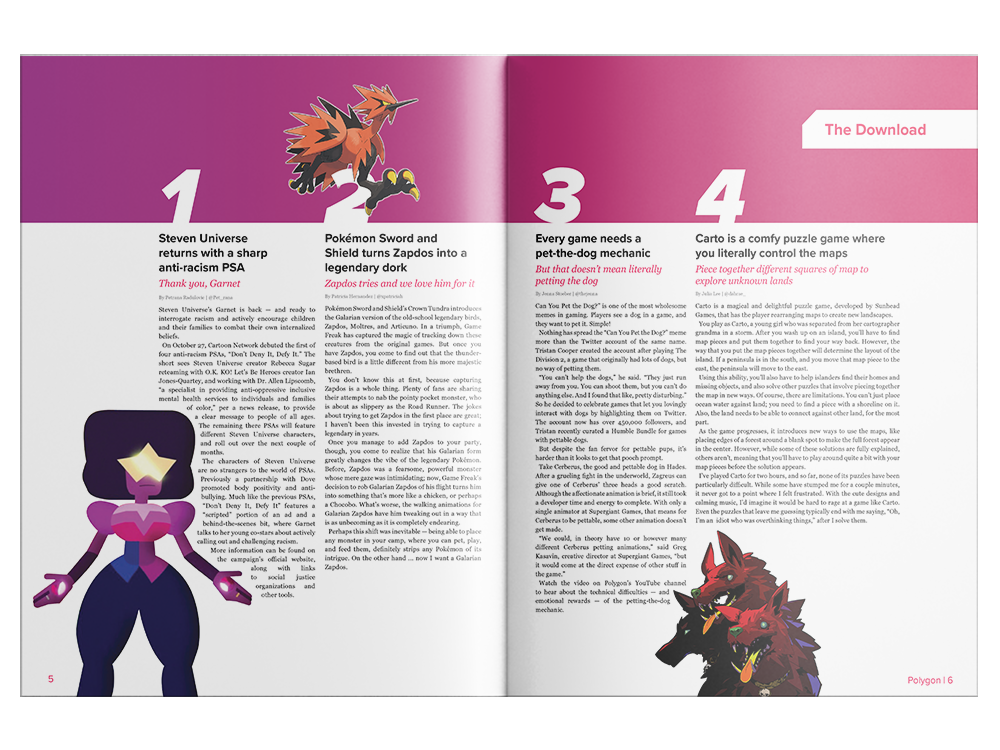
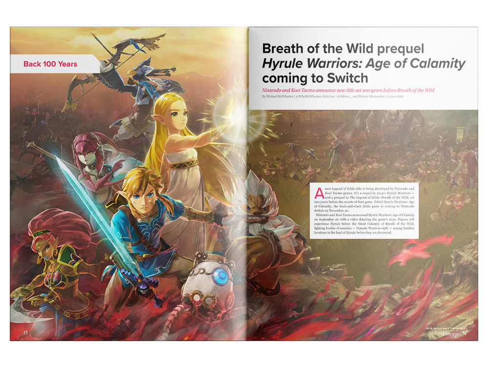
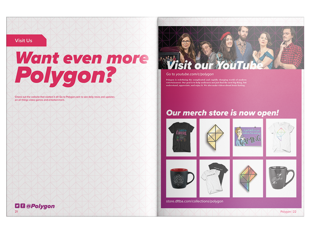
For the magazine to serve as a true extension of the website, I chose to keep as many design elements the same. The color palette and type choices, while being slightly adjusted to fit the print medium, mirror what is used online. The continued use of the pink and purple were important as this is one of the key elements that makes Polygon stand out against other gaming websites.
Cover
The first element I began with was the cover. I tested the new Polygon logo on a few different video game related images and decided a playful interaction between the logo and subject would best get across the idea that this is a fun, less serious, view on the world of gaming and entertainment.
Feature Spread
As the release of the PlayStation 5 fell around the same time as the project, it was only natural to want to dedicate a feature spread to the system. Showing the PS5 itself as an illustration rather than using an image creates a level of mystery, drawing in the curious reader.


